Fitness App is a mobile app made for fitness and workout routines that aids users in selecting the best training regimen for their requirements, preferences, and limitations. Users may search for and reserve an appropriate variety of workout plans or online trainer. Also, users may monitor their progress, set reminders, and design exercises that are specifically suited to their objectives.
Problem
Many individuals want to lead healthy lives, but they face obstacles including time constraints and restricted access to fitness facilities or personal trainers. As a result, many people find it difficult. Without the direct supervision of a personal trainer, users may find it difficult to follow complicated training routines or lack desire and responsibility, which might be harmful to their health.
Goal
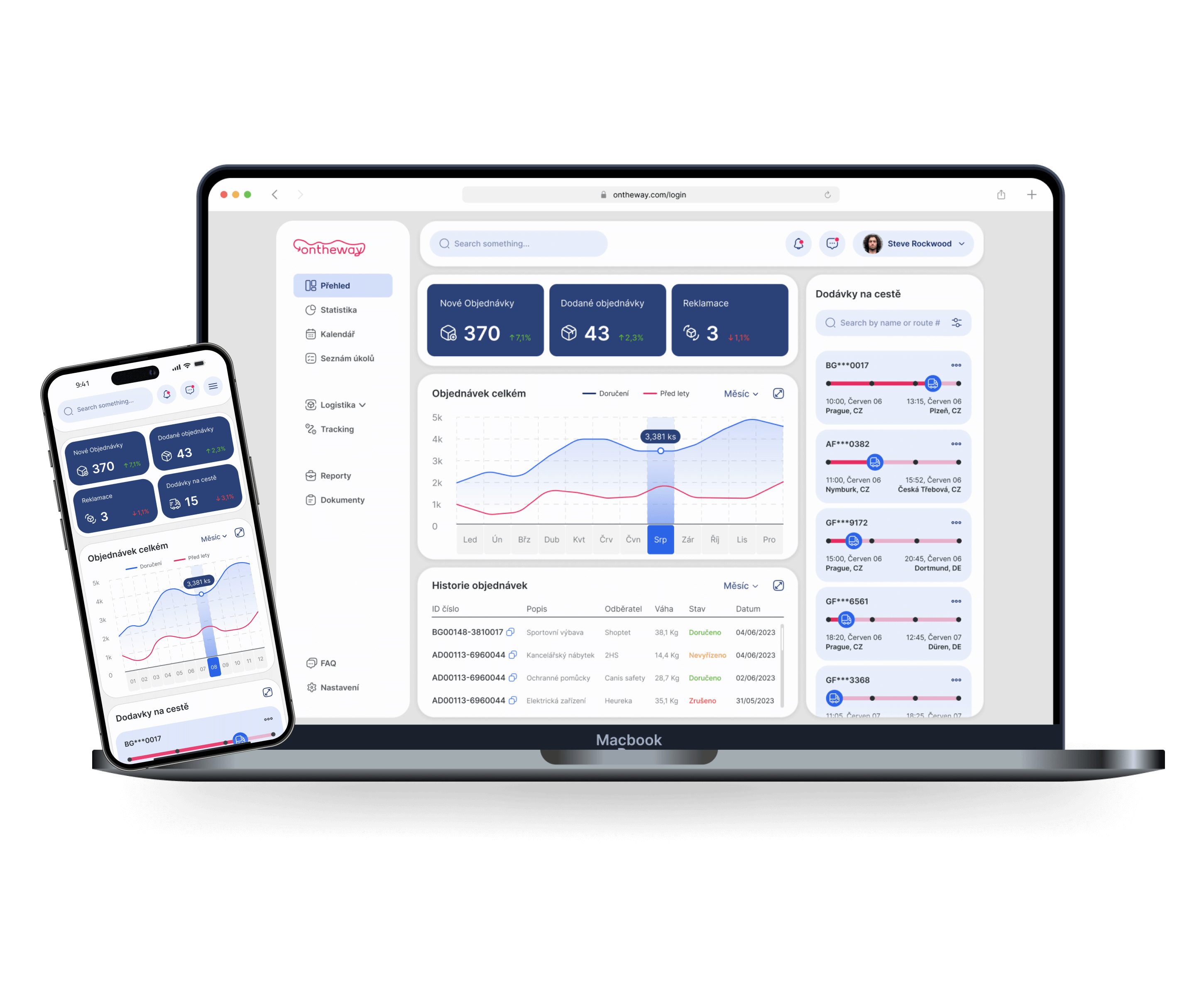
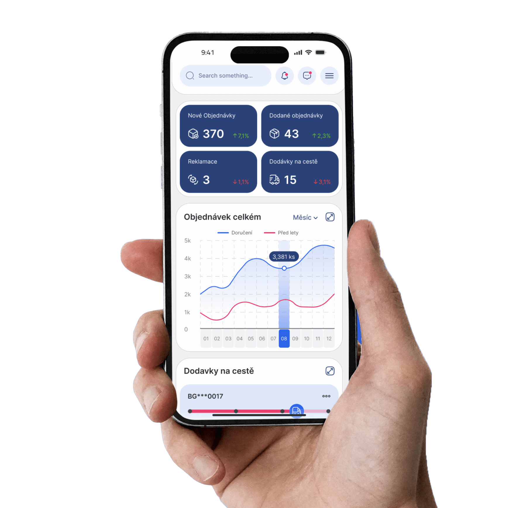
Develop a visually appealing and functional dashboard for the Ontheway logistics and warehouse management softwarethat enables users to efficiently monitor warehouse operations and track deliveries.
Project overview
Introduction
My role
The app's UI/UX designer. User research, planning, usability testing, prototypes, visual design, and branding from inception to completion.
Responsibilities
Conducting interviews, paper and digital wireframing, low and high-fidelity prototyping, conducting usability studies, accounting for accessibility, iterating on designs, determining information architecture, and responsive design.
User research
Project summary
The fitness application should offer customized training options that prioritize to simplicity, motivation, and accessibility, according to user research. Customers want to be able to quickly access their health metrics by measures as active calories and step count, which show their desire to track their progress, according to statistical information.
Additionally, customers want to be able to set up appointments, communicate with online trainers, and also get reminders and guided training programs.
Pain points
First impact
1
Navigation
Not having enough time to organize and prepare healthy meals.
2
Guidance
Lack of motivation and accountability without direct guidance from a personal trainer.
3
Accessibility
Difficulty in finding a reliable and effective fitness mobile application.
Before
Original version
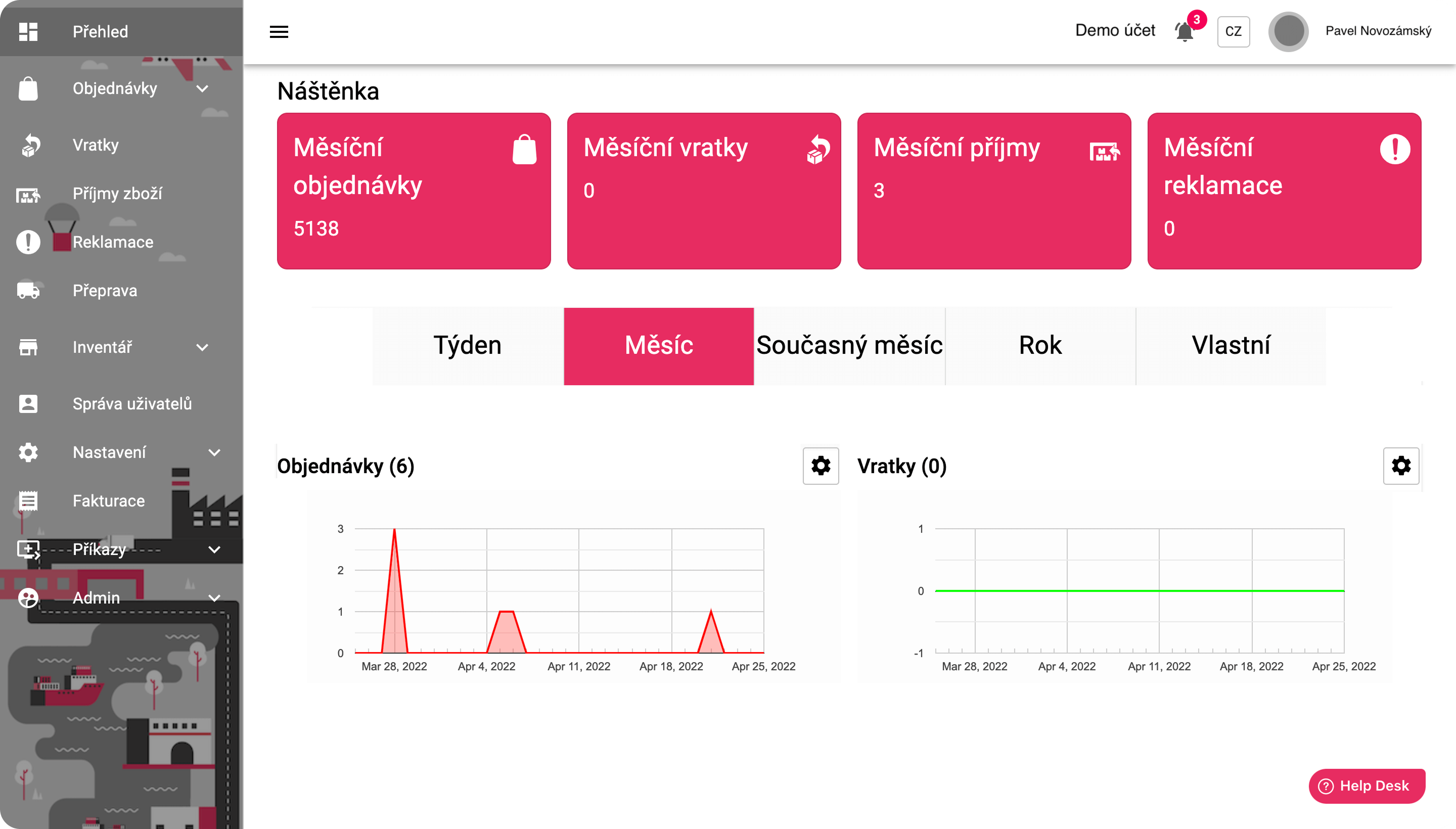
The old dashboard design was cluttered with large buttons and a lot of unnecessary space. Key information was scattered and required multiple clicks to access. The layout was not optimized for quick access to important data, slowing down the user experience and making it harder for users to navigate and get the information they needed efficiently.
After
Innovative version
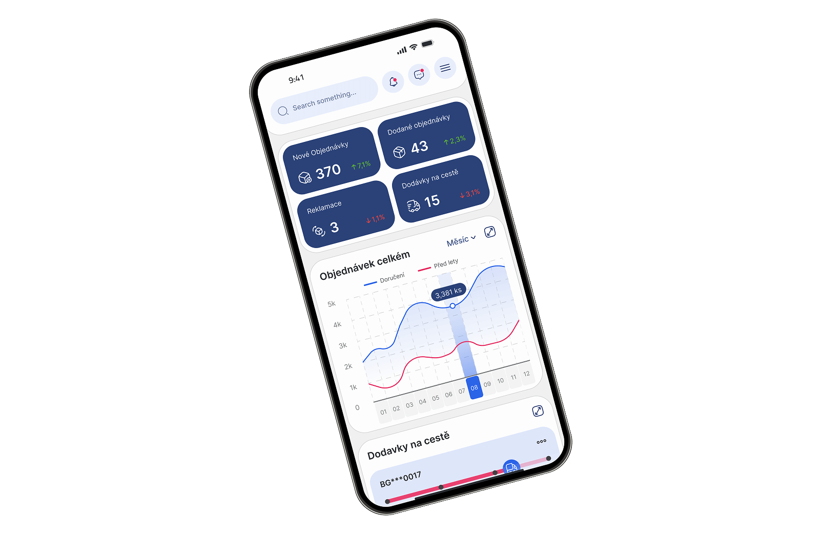
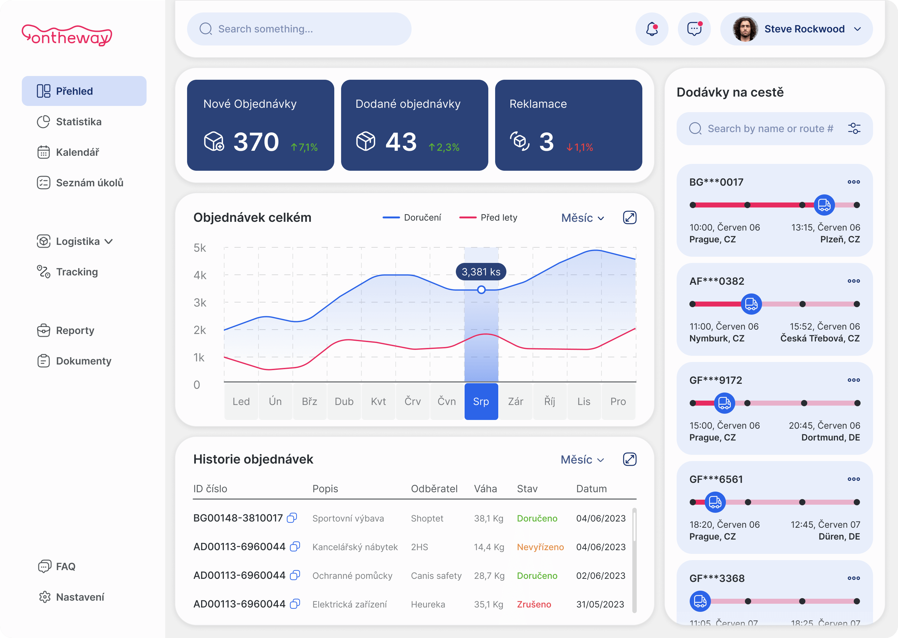
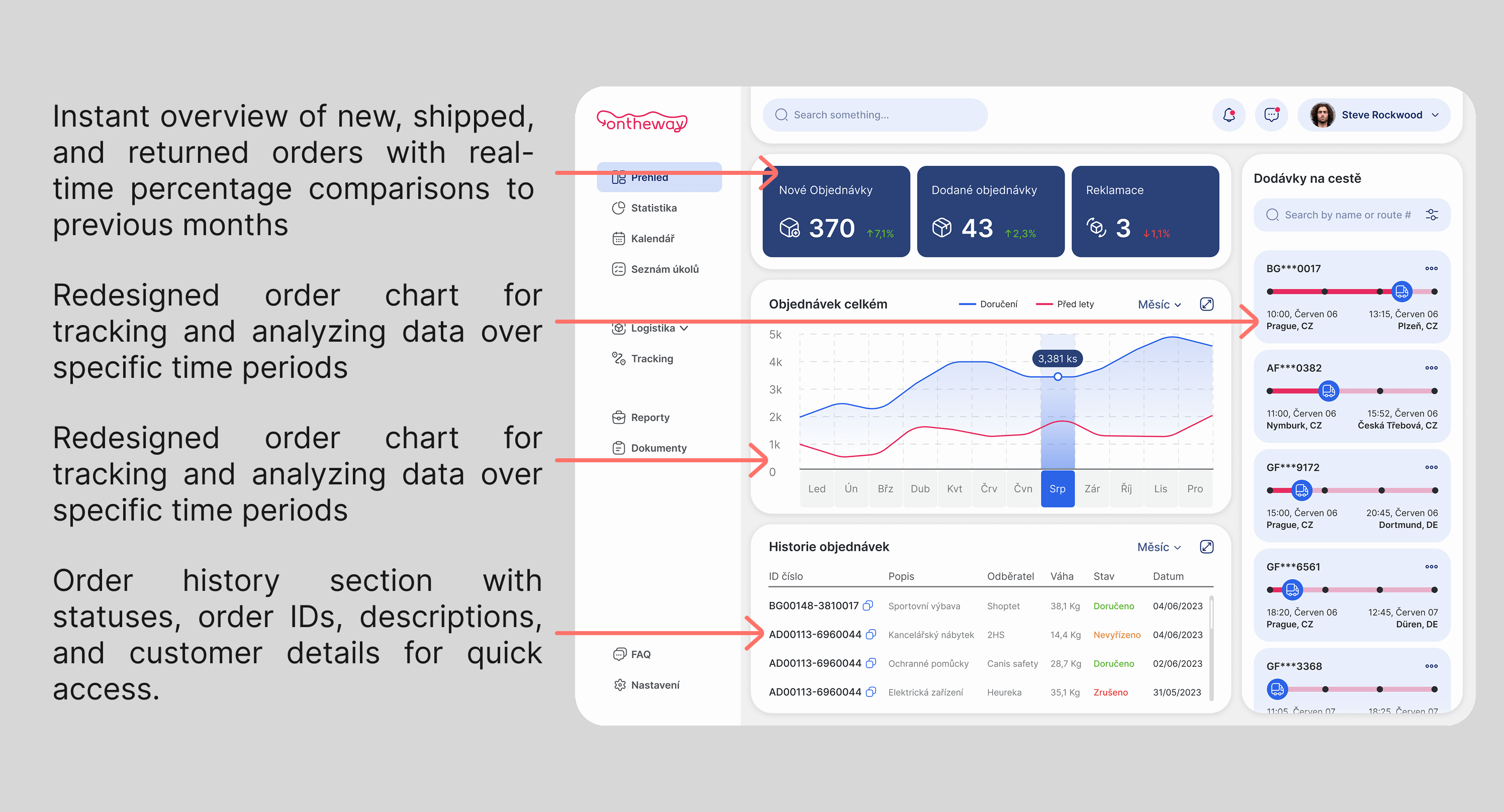
The new design focuses on clarity and efficiency. All essential information is now displayed on the main dashboard screen, making it easily accessible without additional clicks. The layout is clean and streamlined, with a focus on key metrics like orders, shipments, returns, and upcoming deliveries. The real-time comparisons and graphical data representation allow users to make quicker decisions and track their logistics operations with ease.
Ideation
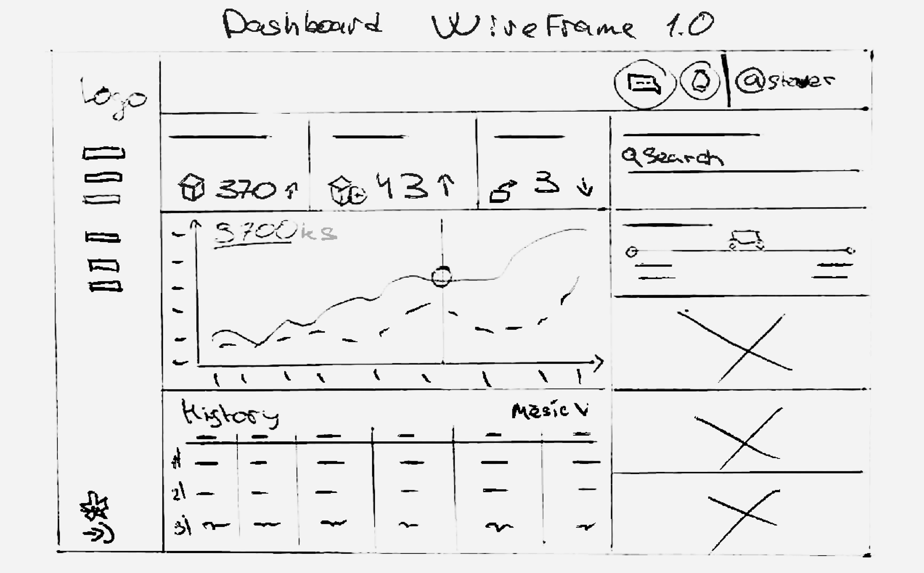
Paper wireframes
After analyzing various dashboards, it became clear that most applications prioritize displaying key information upfront to help users work efficiently without wasting time. This insight led to the decision to rethink the old design, making it more practical and user-friendly.
Ideation
Features
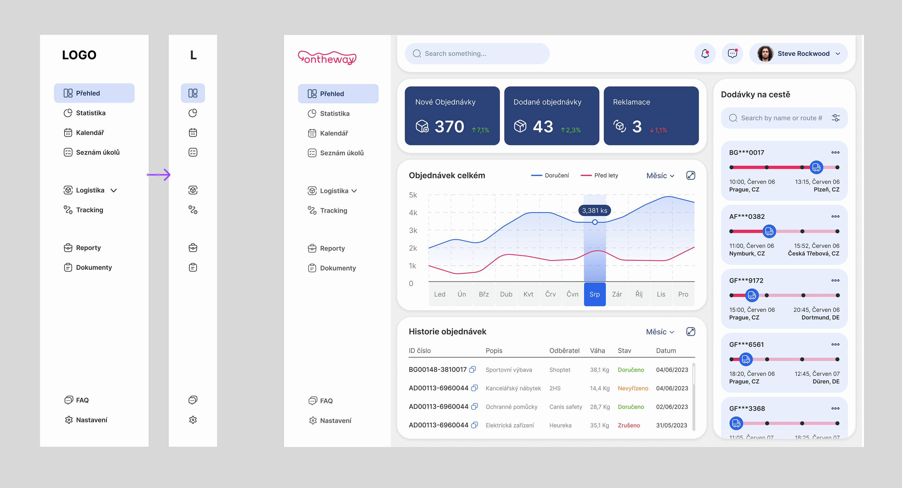
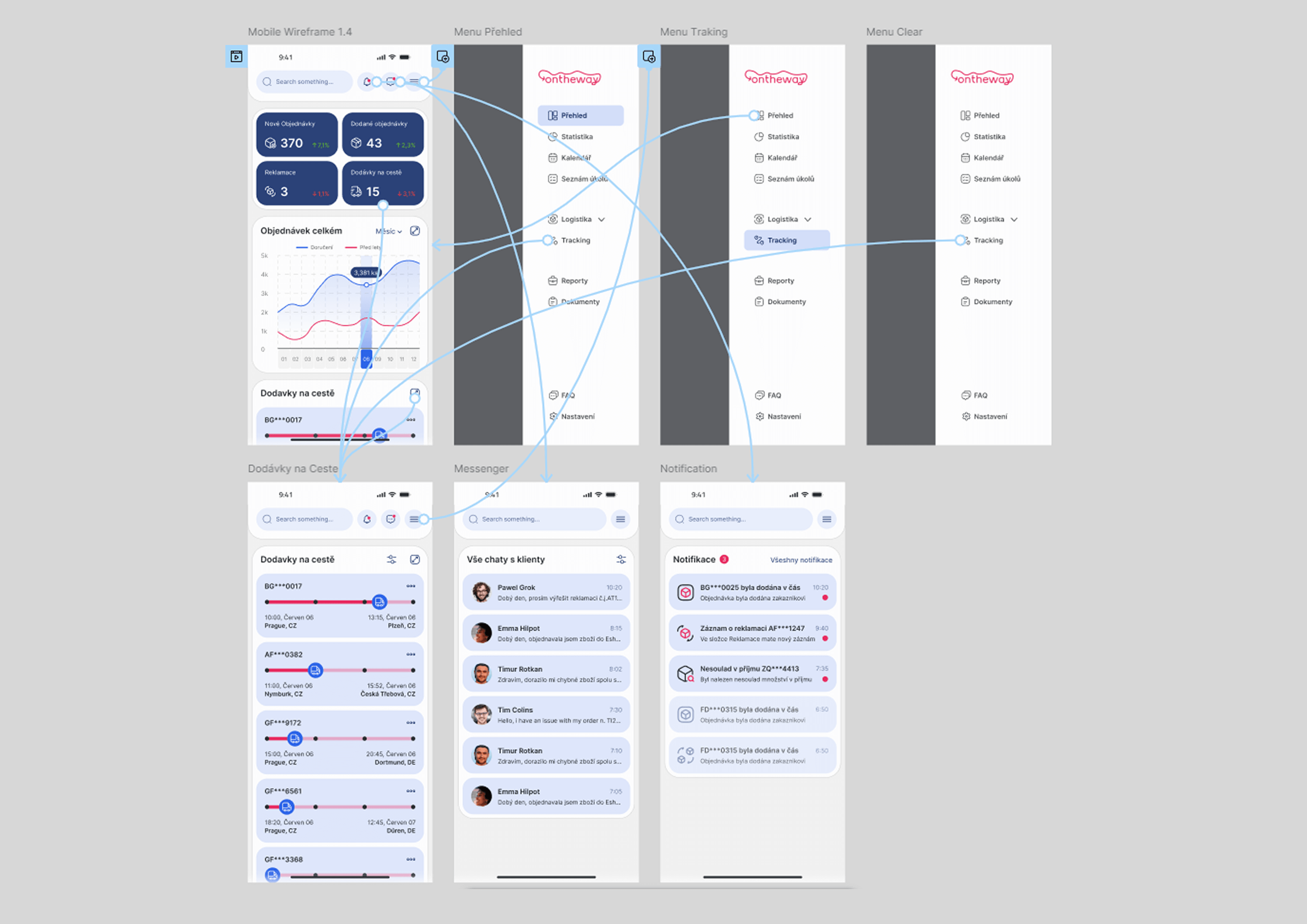
To enhance usability, I implemented a dual-option sidebar menu. Initially, it displays labels alongside icons to assist new users in navigating the interface. Once familiar, users can minimize the menu for a more streamlined workspace.
Ideation
Features
After reviewing numerous logistics dashboards, I found that essential information should be instantly accessible on the main screen. I optimized the dashboard by prioritizing key logistics data—orders, shipments, and returns—while adding real-time performance tracking. A new section highlights upcoming deliveries and logistics milestones, and an improved order history ensures quick access to shipment details.
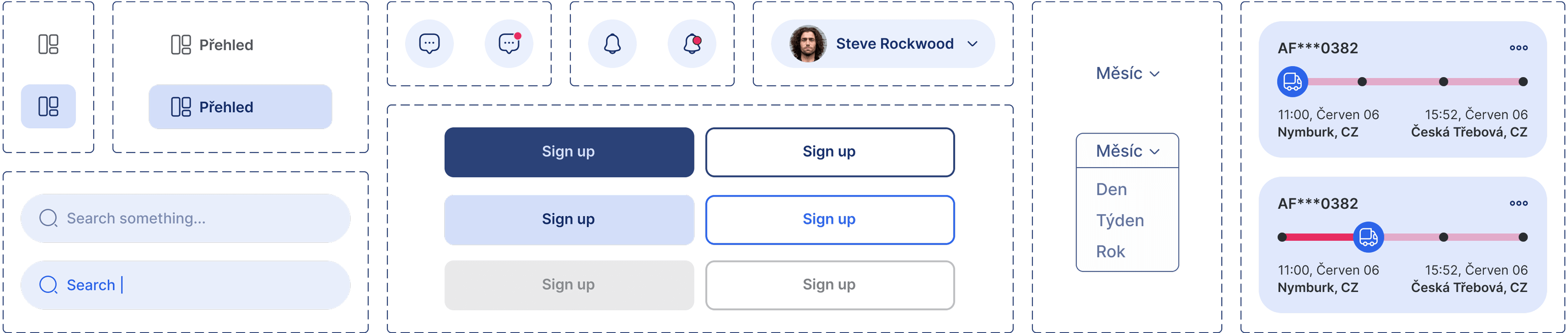
UI Kit
Typeface
UI Kit
Color & Icons
UI Kit
Components
Prototype
High-Fidelity Prototype
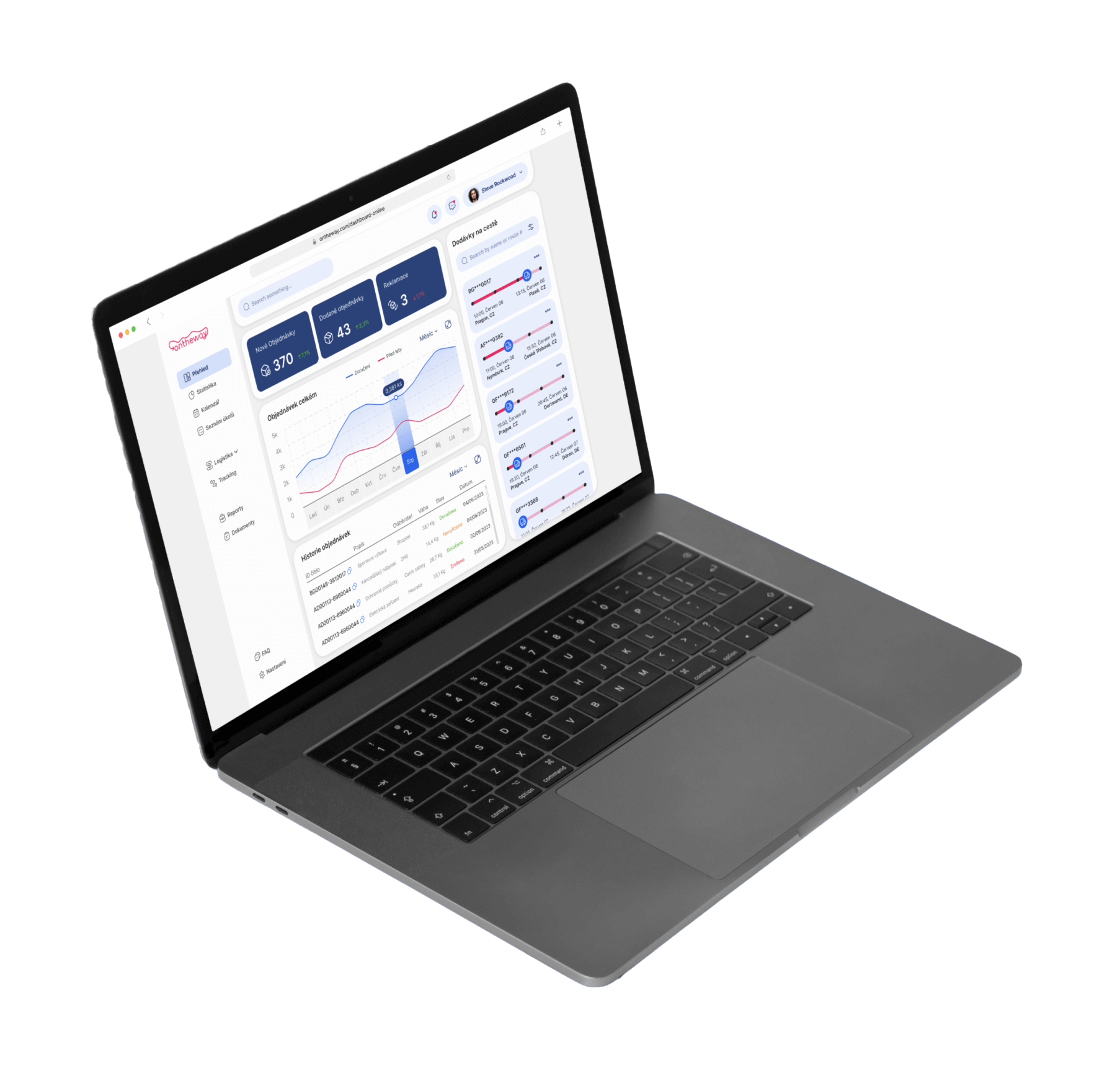
A functional mobile prototype was developed to showcase and test the implemented features. It allows for an interactive experience, demonstrating how key elements of the dashboard operate in real-time.
The redesigned dashboard enhances logistics management by streamlining access to key data. Optimized navigation and improved information hierarchy help users track orders, deliveries, and warehouse operations more efficiently.
My learnings
By analyzing industry standards and user needs, I refined the dashboard for better usability. Prioritizing essential information and designing an adaptive interface allowed me to create a more functional and visually coherent solution.
Pain points
First impact
1
Analytics
Develop real-time alerts and recommendations based on operational data.
2
Customization
Enable users to personalize their dashboard layout for better workflow efficiency.
3
Automation
Develop voice-command features for hands-free navigation in warehouse environments.